Red, Red, and More Red!
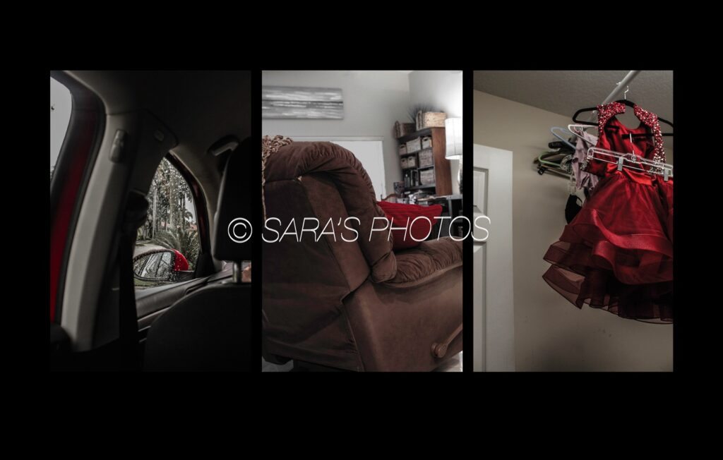
Recently, I have been given the assignment to photograph three items from the back and make a tryptic out of them. I have never tried doing this intentionally, so I was intrigued by this assignment. In some way, all three photos had to coincide, whether that be through a common shape, deeper meaning, color, etc. From the title of this blog post, I bet you can guess what I chose. Color! But not just any color; the color red.
I love the color red because it adds emphasis to a photograph. Also, everyone can perceive this color to represent different ideas, whether that be tension, anger, passion, or love. This leads the viewer to be able to interpret the photograph however they feel connected which is what makes photography impactful.
Immediately, I thought of several objects that I could photograph with a pop of red but narrowed this selection to three which would visually look the best together. For example, in my final tryptic, the first photograph has negative space on the right side and the third photograph has negative space on the left side with the middle photograph not having much negative space, making the tryptic balance out.
Working with color can be scary and intimidating in photography since too much color can make a photograph too saturated. However, I recommend doing photography projects one color at a time to get a hang of working with color. In this project, I focused on solely one color and found myself content with the outcome as it is not too bright or busy as some may be fearful of. Hope that this post serves as an inspiration to those who seem afraid of using color in photography! Follow my Instagram and Pinterest for updates about future posts!